9 Things the Market Wants From Your Logo
Jan 07, 2022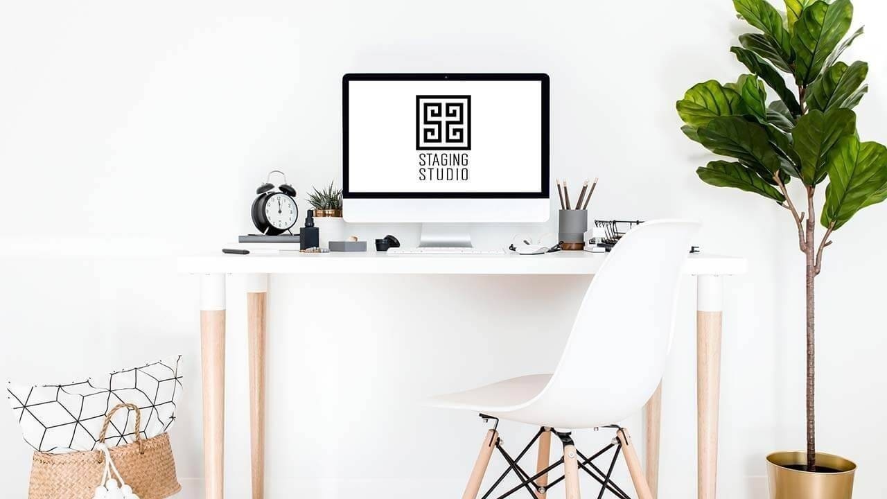
Branding your staging business is essential to marketing yourself to clients. Home staging is such an aesthetic industry, it is imperative to mirror your staging quality with the quality of your branding. The heart of your branding is your staging business logo.
Your logo may be the first impression clients have of you. You need a logo that is memorable, unique, and sends a message – that your company provides high-end, professional staging and redesign services.
How do you say all that with just one small image? Just consider these 9 things the market wants from your staging business logo.
1. Include your business name
Tie your name and any logo symbols together for recognition. For example, the Staging Studio logo features a Greek key design (resembling “SS”) along with the text, “Staging Studio.”
![]()
There are many beautiful logos out there that only include a stylized business name, without any imagery. This may work for you, too, because it is a great way to keep your logo simple (more on that later).
Some logos are only an icon, without any text, such as Apple or Instagram. These are mega-brands with nearly universal recognition. They may be able to get away with a logo without their business name, but we do not recommend that for staging business logos.
2. Reflect what you do
Make sure it passes the ‘grunt’ test: a caveman could look at it for 5 seconds and have a clear idea of your services (hello – staging!). This is why it is so important to pick a great staging business name.
You have a lot of options for icons in your logo, but one possibility is to go literal and incorporate imagery of a house or furniture. Staging Design Professional® Ashley James incorporated a home into the logo for her company:
![]()
The house iconography, paired with the business name, allows James Staging Co.’s logo to quickly pass the ‘grunt’ test.
4. Go simple
Too many colors, icons, words, and other elements can distract from your message. Make your staging business logo clean and simple.
The Haven Home Staging’s logo is successful because it is so simple. The stylized script font with its gold gradient is enough to make this logo memorable and beautiful:
![]()
5. Stay consistent with your branding
Consider the fonts, colors, and icons that you plan to use across your staging business branding strategy. Your logo should fit right in.
The Master Stagers at Decorus Home Staging use these same fonts throughout their website and branding:
![]()
6. Follow the rules of good design
This is where your training as a Staging Design Professional® comes into play. Above all else, your logo should show that you have expert knowledge of design rules like balance and scale. After all, your job is to design beautiful spaces. If your logo is not aesthetically pleasing, potential clients will assume that your staging is amateur, too.
By giving your logo a luxury look, your clients will know that your work is quality, too. Styled & Staged Santa Barbara’s logo is a grand slam – the simple but stylish icon tells you that they are a luxury brand, and it also is very clear where they are located and what they do:
![]()
7. Don’t make it too cute or trendy
If you choose a super trendy design, chances are that it will be out of style in a few years, and you will have to redesign your logo. That is not good for brand recognition.
We made this mistake when we first started our home staging business. Our logo gave the impression of: “We are San Antonio!" It reflected the warm colors of our city with a background look of Redondo tile, which is seen in many historical homes around our area. Everyone loved it!
But, our logo quickly became outdated. We modernized the fonts, simplified the design, and made it black and white to create a more timeless logo:
![]()
8. Review color strategy
Color influences perceptions. We go over this in-depth in our Master Color Consultant® training.
For instance, the color blue inspires trust and is chosen by most people as their favorite. This is why blue is often a favorite accent color for staging and logos. Remember, if you choose to introduce color into your logo, you should keep the other elements to a minimum to prevent it from becoming too busy.
Pro Tip: Certain colors may seem classic, but in reality, shades of colors go in and out of style. We highly recommend keeping your logo colors black and white, like Upstaging Seattle’s logo:
![]()
Sticking to black and white makes it so much easier to create a beautiful website. When you have colors in your logo, they will have to work with the pictures you put next to the logo on your website. Think of it like the flooring in your kitchen. You have to match the counters and backsplash to it.
9. Get it done
While designing your logo, you may experience “paralysis of analysis.” There are so many fonts to choose from, and you want it to look a certain way. Consider all the above, make a decision, and get it done!
If you want to learn more about becoming the go-to staging expert in your area, our Staging Design Professional® course includes everything you need to be a BOSS Stager!
Don't miss our next blog like this!
Join to receive the latest news for home stagers.

