Current Paint and Color Trends in Home Staging
Jul 05, 2023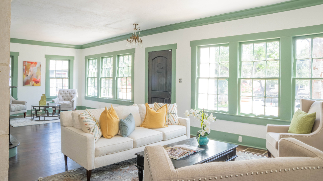
Your job as a home stager is to make every listing look updated and appealing to today's buyer. Sometimes that means you might need to suggest a fresh coat of paint.
To confidently select updated paint colors, it's important to be aware of the latest paint trends. Your paint suggestions will elevate the listing’s perceived value and net the sellers the highest profit. The right color scheme can make a world of difference and set the tone for any room.
Note: We use Sherwin-Williams colors in this blog and in our own color consulting business, but any color can be color matched with another brand. In our design courses, we teach strategies over specifics.
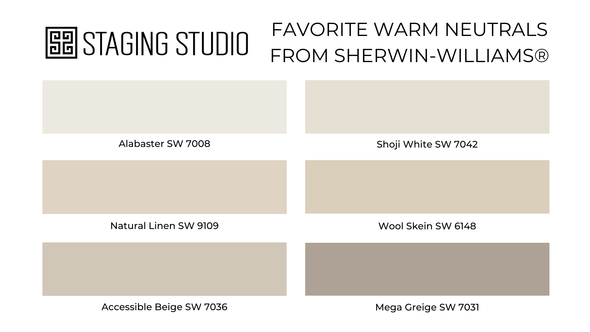
Neutral Paint Colors are Warming
Neutral paint colors have long been a popular choice for home staging. The goal of home staging is to enhance the listing so any buyer can picture themselves living there.
When a buyer walks into a home painted a bright color that they don't like, it is difficult for them to imagine the home painted in their favorite colors. However, buyers can easily imagine customizing a home that has been painted in neutral colors (like these 20 best white paint colors).
Light neutral tones can make a space feel bright and open. We are selling square footage, so we want the listing to appear as large as possible, and light neutral paints can help us do that.
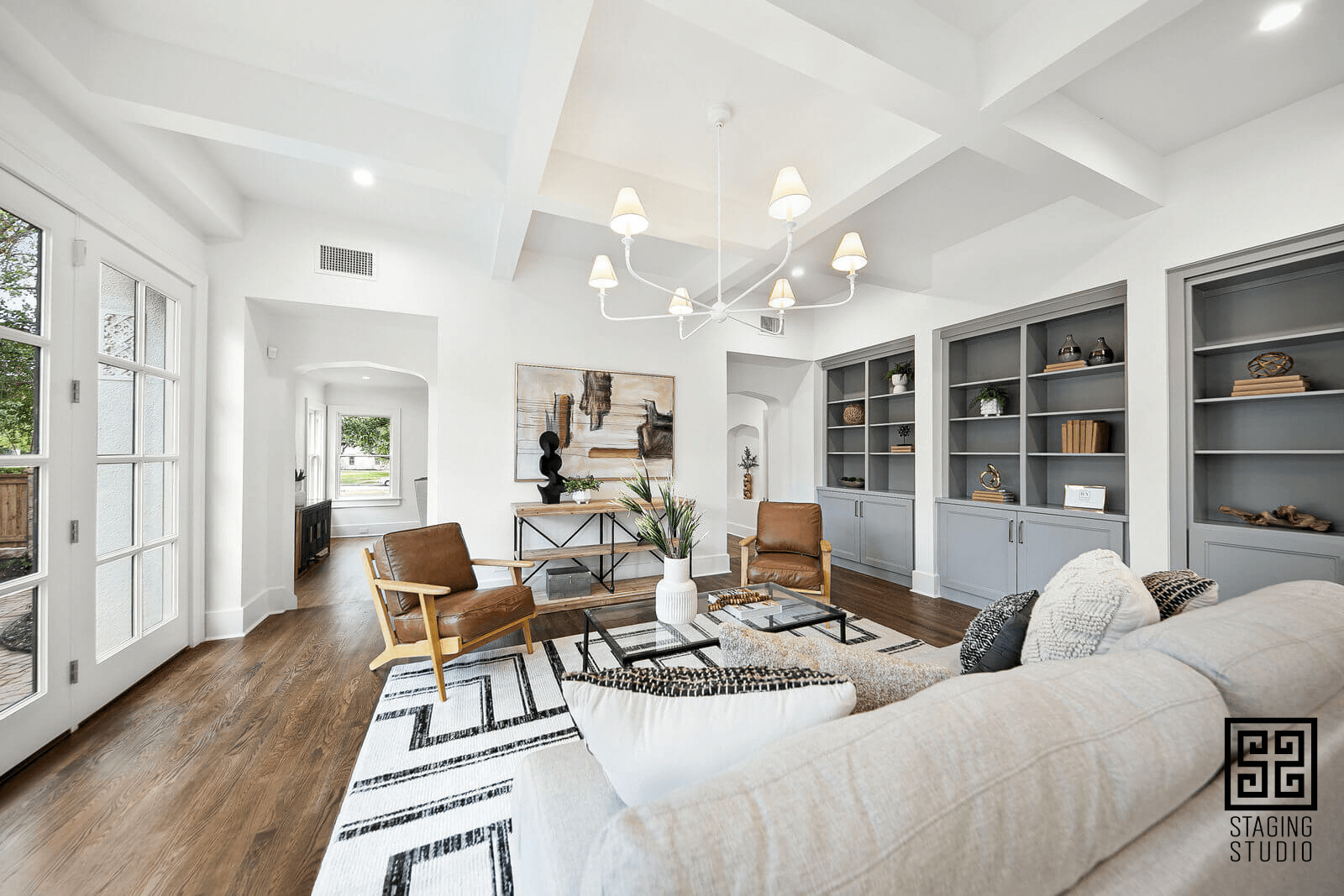
In recent years, cooler grays were popular for walls, woods, and flooring. Now, there is a shift towards warmer neutral paint colors. These softer, warmer tones create a sense of comfort in a space. Whites are more rich and creamy. Colors like creams, beige, taupe, and warm grays create a cozy and inviting atmosphere, perfect for a living room or bedroom.
Warmer neutrals have more depth and complexity than cooler neutrals. This can create a sense of richness and texture in a room, and can add visual interest without being overwhelming.

Pro Tip: Professional home stagers understand the undertones of colors. There are at least 9 different neutrals. Pink beige, yellow-beige, green beige, violet beige, blue grey, green grey, violet grey, taupe. Taupe and beige are warmer. Greys are cooler. Of course, there is also griege... As a Master Color Consultant®, you'll be able to articulate the differences and find the perfect shade for every space.
Here are some of our favorite warm neutrals:
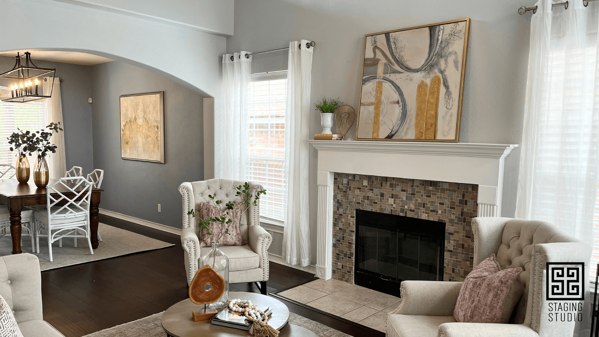
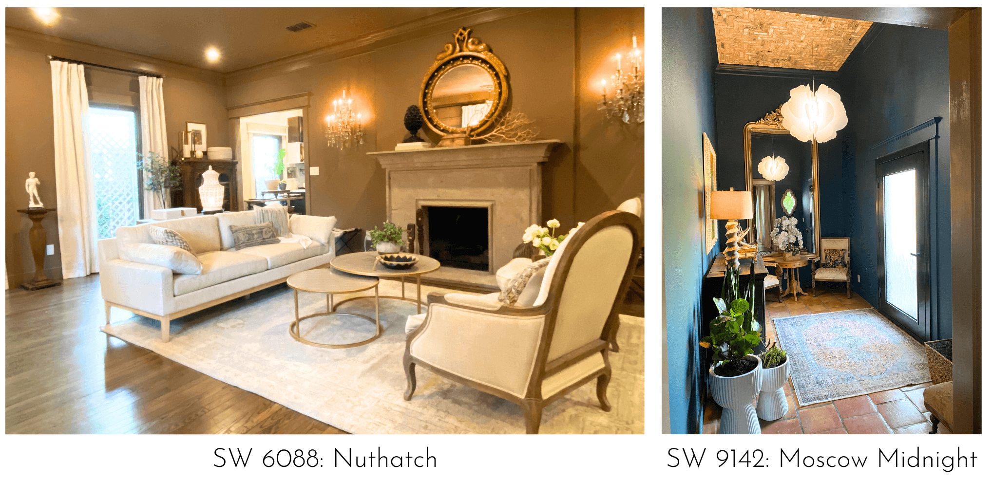
Case Study: How to Stage a Room with Gray Walls
If your staging business is anything like ours, you will stage a lot of homes that haven't seen a fresh coat of paint in 15+ years. Many of the homes we stage have cool gray walls. And we don't mean "cool" as in hip - we mean "cool" as in not a "warm" undertone.
We updated this gray-walled home by bringing in some warmer neutrals and mixing the gray with it. Gold can be very useful to warm up the space and bridge the gap between grays and warmer colors. Notice how we added warmer neutrals and gold to this home for a more updated, but still transitional look.
The Ceiling is the 5th Wall
The new accent wall is on the ceiling! Don’t want to paint the whole room a bold color, but the space still needs some drama? Consider the ceiling.

Another option for updating the room using only the ceiling is to add wallpaper or extra moldings to it. While adding rustic beams and shiplap have been on-trend in recent years, we are seeing ceilings get a more glam makeover.
Millwork is Having a Moment.
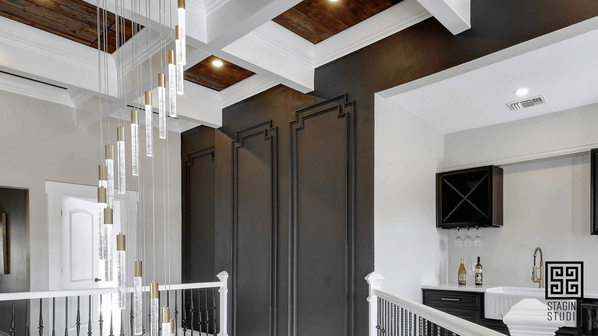
Moving away from the simplicity and clean lines of Japandi, more is now more when it comes to millwork. Think deeper crown moldings and added picture frame moldings. All of that trim is often the same color as the walls. This one-color look makes the room feel larger and more cohesive. The best benefit to this trend is that it takes the guesswork out of what color trim to use!
Trim Can Now Be Darker Than the Walls.
One of the most popular trends is the use of deeper tones on the trim, which can add depth and dimension to any room.
When it comes to using contrasting colors on trim, it's important to choose colors that work well together. This can be a bit tricky, but a good rule of thumb is to choose colors that have similar undertones.
What are some on-trend color combinations for walls and trim for 2023? Here are some of our favorites:
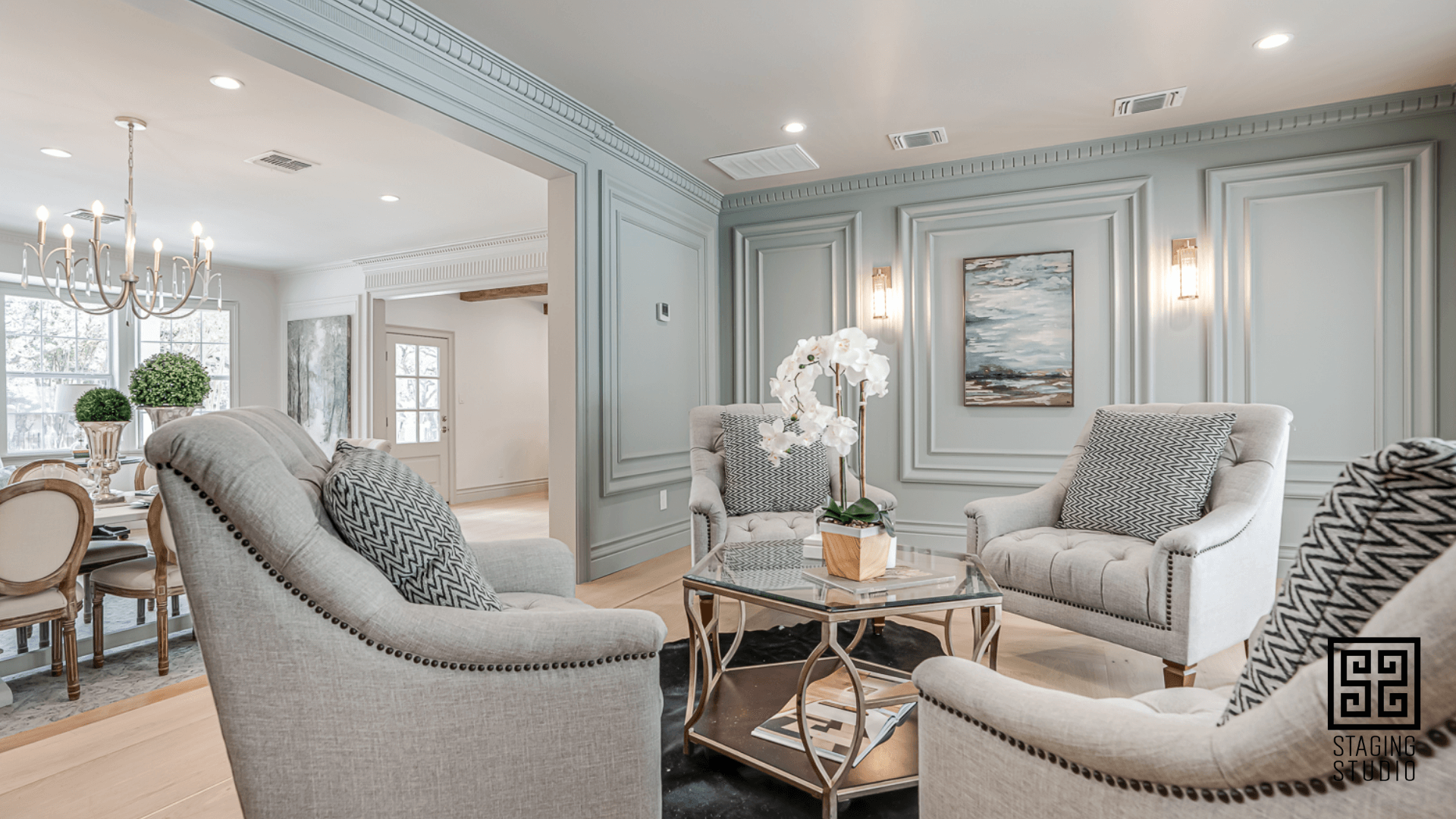
Color Drenching is the Big Trend in Paint.
This is where everything, including walls, trim, and ceiling are all one color for a very updated look. Instead of being painted with the traditional contrasting white trim method, match it all so that there is no stopping point for the eye, whether the walls are white or some other color.
This lack of a break at the top of the walls makes the ceilings appear taller and the room larger. Extra crown molding makes this illusion even stronger.
The Return Of Pretty
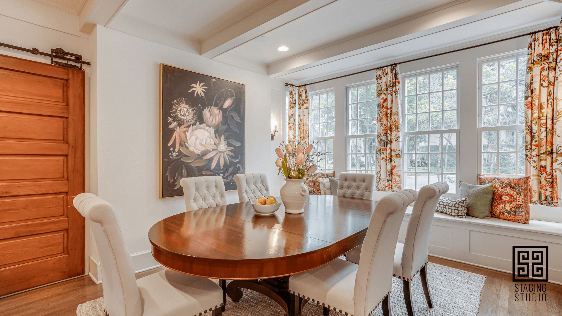
We are seeing a shift in the interior design world that has been dominated by minimalism and stark, monochromatic color palettes for many years now, towards a more feminine and romantic aesthetic. This trend, which is being dubbed "the return of pretty," is all about embracing softness, pastels, and delicate details.
So what exactly does "the return of pretty" look like in home staging? Here are a few key elements:
Floral patterns: Flowers are a key element of this trend, and floral patterns can be found on everything from wallpaper to upholstery. Whether you opt for a bold floral print or a more subtle, understated design, flowers are a great way to add a touch of pretty to any space.

Vintage elements: Another key element of this trend is the use of vintage and antique elements. Whether it's a vintage rug or a Victorian-style armchair, these pieces add a sense of history and nostalgia to a space.
Overall, "the return of pretty" is all about creating a space that feels soft, feminine, and romantic. It's a celebration of all things delicate and lovely.
How to Use the Trends in Home Staging
At Staging Studio, our mission is to teach home stagers how to build profitable businesses that they LOVE. But, the only way to have a business you love that also makes money is to ditch the overwhelm.
After hearing about all the gorgeous trends, you may be tempted to feel like you have to buy a bunch of new staging inventory. Nope. You don't!!
When you buy classic, neutral pieces from the beginning, you can add in some more updated art and accessories and always have a refreshed look. Do not feel overwhelmed by this blog! Instead, we hope you feel empowered!
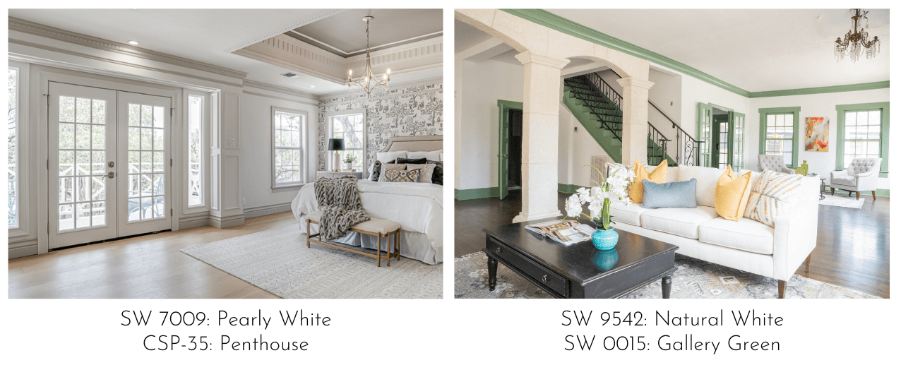
Now you can go into any consultation and completely wow your clients by simply suggesting that they update all those gray walls with a warmer neutral like SW Shoji White. And when they say they really want your color recommendation on an accent wall, you can tell them that a much fresher way to achieve the drama they are looking for is to paint the ceiling instead!
Beautiful spaces start with color. As a certified Master Color Consultant®, you’ll not only select the perfect color for the space, but you’ll learn the psychology behind color, successfully market your color services, identify undertones in a snap of the fingers, and so much more! We will help you unlock the secrets of your Sherwin-Williams® paint fan deck.
Don't miss our next blog like this!
Join to receive the latest news for home stagers.

